Website Home Page Design Tips for Beginners.
Tips For Awesome Home Page Design Layouts.
Different fields and equally different work opportunities are available now-a-days. People are skilled in their respective fields of interest. If you are building a website, although you are not a website designer and you want to make it look captivating then you need not to worry. You have reached the right place to take guidance on how to make aforesaid possible.
The job is not as tough as it sounds to be. People preconceive that building a website is complicated but with this article your misconception will be changed.
In this article we will read about how to make an effective home-page layout design.
But before going into the details of it, let us know what makes a home-page an important part of a website? Or to put in other words, Why is there a need to give due focus on your website’s home page?
 |
| Tips for Effective Homepage Design Layout |
Well, here’s the answer to the question above.
“When the visitors will visit your website, the first impression they will get of you is by the home page and first impression is what it takes to make rest of the game strong. “
Therefore, you must focus largely on your homepage and make sure it works effectively leaving a positive and strong impact on the visitors.
Now, you firstly need to elaborate what would be the effective home page layout design?
 |
| Page Layout |
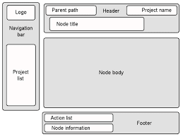
” Page layout is basically the arrangement of visuals elements on a page.
How you organize and put content on your website page is called its layout. “
You cannot just place anything anywhere on the website page rather you need to be very logical and craft your page layout in a way that could guide and help your visitors to discover the website as you like.
Your page should be designed in a way that tells about you (your business/brand/work).
Let your page guide your visitors on to proceed further and reach the next step. Failing at which, your visitors will leave out of frustration of not getting the idea where to go next.
Next step could be sign up stage, watching or downloading something, filling details or so. The aim is to make the website easy to use for the visitors. It’s all up to you how well you craft your website to control your visitors focus and attention on to the things you want.
Ultimate Tips For Effective Homepage Design Layout for your Website:
A perfect homepage design is what every business owner dreams of to get that winning first impression. However, very few know the game behind getting it and end up with whatever they can manage to get. Check out the ingredients to a effective home page design here..
 |
| Sample Homepage
|
Key Ingredients To Effective Home Page. Let us see:
Here we will bifurcate the ingredients into two distinct parts namely;
- Primary Ingredients &
- Secondary Ingredients.
1. PRIMARY INGREDIENTS of HomePage Layout
Primary ingredients comprises of the content which is visible to you without the need to scroll down the page when home page is opened.
It is basically Above-the-fold layout. Herein you put the content with the aim to make your visitors hooked to your website so as to search about your offerings. You must be brief and concise as far as primary content is concerned.
Again, the primary content is further broken down into three parts:
a. Headline
Ø Short and precise.
Ø Must be able to answer the visitors about what you do or offer.
Ø Simple and should convey some message to the visitors.
Ø Must be impactful and able to grab the attention of the masses.
b. Sub-Headline
Ø Must be effective.
Ø Have a description about how your products or services may help the visitors.
c. Call To Action
Ø Must guide and allow the visitors to go/take the next step.
Ø Example:- “Click here to download”, “Call us now”, “Sign Up” etc
d. Use Visuals
Ø Images or Videos are more influencing and captivating.
Ø Use videos or images relevant to your website to convey the message to the visitors.
Ø Use professional/high quality images.
How to Use Images on your Website for Better Impact?
e. Logo
[ Logo Designing Tips ]
Ø Make use of tools to design the appropriate logo that speaks of your business and become its identity.
Ø Be creative here.
f. Navigation Bar
Ø Guides the visitors on where to go so as to find certain information.
2. SECONDARY INGREDIENTS of HomePage Layout
Secondary content is that which is not as crucial like that of primary as its only job is conversion i-e converting your visitors into customers/followers. Therefore, this content does not need to be put on above-the-fold.
Ø List out the benefits they can derive out of your offering (so as to tap the emotional side of visitors.)
Ø List out the features to let the visitors know the value of your offering. (Make sure you don’t over write and bore them.)
Last but not the least you can even put up some additional content to give more elaborated and detailed information which is necessary for the visitors to know but are not really mandatory or critical. Just a choice.
Leave a Reply